Arriving at work and the first thing you do is opening your Power BI report and going for a coffee while waiting for the report to render. Seems familiar?
Well, it shouldn’t. Your reports should render instantly, especially if there is a large or C-level audience consulting them on a regular basis. Luckily enough there are some tips and tricks to melt your frustrations like snow in the sun.
1. Only keep necessary visuals![]()
Every single additional visual needs time to render and will therefore slow down your report. And if, in some cases such as when relying upon bookmarks, you really see added value in enriching your report with a bunch of shapes or data visualizations, please do hide them whenever possible. As hidden visuals won’t be rendered, they do not have a single impact upon report performance.
2. Use integers instead of text values whenever possible
![]()
String values do not compress as well as integer values. By replacing string values with integer values, preferably at source level, both .pbix file size as total memory size will reduce exponentially. Examples: Adjust data types of numeric codes to integer values where possible and use 1/0 instead of TRUE/FALSE.
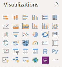
3. Stick to Power BI’s default visuals
![]()

Report developers are often very tempted to scroll through the list of third-party visuals, which can be found in the marketplace, and end up importing them. In some specific business scenarios, they can actually be very suitable. However, please do use them with care. The biggest performance wins I’ve ever made was accomplished by simply converting third-party visuals to default visuals.
4. Avoid both-directional relationships in your data model
![]()
The number one performance killer. A both-directional relationship between two tables actually means both tables will cross-filter each other. This has a serious drawback on report performance as every interaction is very plausible to cause a loop of filtering actions, especially when your data model consists of multiple enabled both-directional relationships. Optimal data model design is key. Alternatively, DAX’ CROSSFILTER() function can come in handy as well.

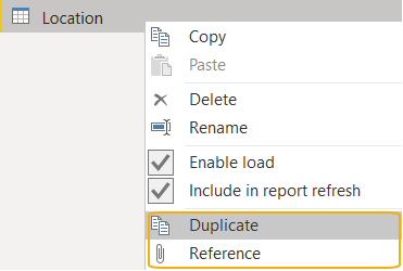
5. Understand the difference between duplicate and reference queries
![]()
Duplicate queries will simply serve as a one time copy of the M query code whereas referencing a query also pushes through any changes performed on a referenced query to the queries referring to this query. Does this impact report performance? No, but it goes without saying the latter improves query maintainability as you only need to adjust the referenced query.

6. Only load data which will be reported upon![]()

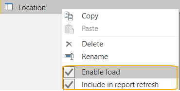
What about the options to “enable load” and “include in report refresh”?
Many of you have probably came across these options when developing reports but don’t exactly know how to correctly interpret their function. When the enable load checkmark is unchecked, data won’t be loaded into memory. The respective query will still be available in the query tab but will not be cluttering your data modeling or report view. This is often used for intermediary queries: intermediate results you want to refer to or merge/append other queries with.
There is a clear distinction with the “include in report refresh” option: when unchecking this checkmark, data simply won’t be refreshed when you click the refresh button of your report. These query fields will still be visible in your data modeling and report view if you have the “enable load” option checkmarked. This feature is perfect for preventing static data from redundantly refreshing. Additionally, incremental refresh can be configured as well for example to prevent frozen historic data from refreshing unnecessarily. This feature used to be premium exclusive but it is generally available as of the end of February 2020 for Pro users as well, so make sure to check it out!
7. Slicers can be real performance killers
![]()
These are quick wins: change your slicers to dropdown instead of list. When a user opens a report, all (non-hidden) visuals require render time: the time Power BI needs to actually load & show a data visualization. Slicer lists will last longer to render in comparison with slicer dropdowns as the former presents filter values on report initialization. The latter will only load filter values when a user triggers the dropdown.
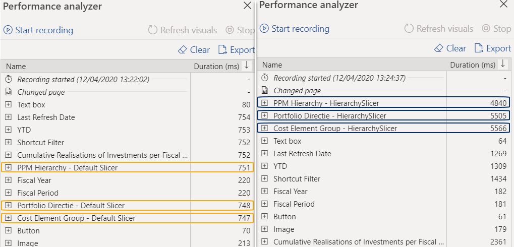
Even more important, is the slicer visual selection. As stated before, you should try to stick to default visuals if possible instead of relying upon third-party visuals from the marketplace. However, there are some value adding visualizations in there as well. To provide you with a clear example visual significantly contributing to user experience, the market place’s portfolio includes the so-called ‘HierarchySlicer’. This visual -unsurprisingly- enables users to add multiple fields to one and the same slicer, creating a hierarchy. At the time of report creation, Power BI did not offer the possibility to add multiple fields to their default slicer.. YET. As of Power BI’s February 2020 update, the default slicer now also supports hierarchies. In fact, one of the biggest performance wins I came across existed in simply changing a the third-party ‘HierarchySlicer’ to the Power BI default variant reducing report render time with an astonishing 90%. Continue reading to learn how you can measure performance.

8. Overthink your data modeling technique
![]()
I’ve had fantastic experiences reporting on a dimensional model. Bottom line, creating report look and feel should only take up a small proportion of your total efforts spent. Designing the right data model will mainly decide whether your reports will behave in a performant way. I am aware there are several ways to design a data model but I can only strongly advise to stick to Kimball’s approach. Other best practices you should keep into account exist in:
The use of surrogate keys
The use of role-playing dimensions
The determination of fact(s), possibly enabling parallel loads
No snow-flaking
Please do mind I only scratched the surface of dimensional modeling here. Always try to question your decisions in your journey to the ideal data model. Critical thinking is key. In most cases, an additional pair of eyes won’t harm.
9. Split granularity to lower cardinality
![]()
To perform calculations one or more requests are sent to the storage engine where the data is stored. This could be either an external relational engine (DirectQuery) or Power BI’s storage engine, called the Vertipaq engine (Import). Due to the variety of DirectQuery connections, I’ll be focusing on the latter. In contrast to a traditional SQL database, which evaluates data row by row, the Vertipaq engine saves data into memory in a columnar format.
With this small introduction to the Vertipaq engine, I want to draw your attention to how Power BI handles its imported data: the higher the cardinality of a column, the longer Power BI will need to perform its calculations upon this data. Put in other words: try to limit the number of distinct values of an attribute.
For example, you could split datetime fields in a date and a time field. Consequently, memory load will be reduced to a minimum as both fields will have a much lower cardinality in comparison with the original datetime field. This is something very case specific but I hope you were able to grasp the idea.
10. Measure performance !
![]()
Get a clear view on how a report is currently performing so you can quantitively measure and compare the outcome of any of your taken actions. Power BI has a built-in feature, called the performance analyzer, enabling users to measure how much time is spent on rendering visuals and how much time is spent on executing DAX code. It even gives you the full extract of the DAX code, which you can further analyze in tools as DAX Studio .
Remember the difference between Power BI’s updated default slicer and the HierarchySlicer, imported from the market place? I’ve compared their performance on one of my reports resulting in the following excerpts:

Wrap up
![]()
The above tips and tricks are some of the actions you could opt for while tuning performance of Power BI reports. I did not have the intention to assemble a complete list. There are several more options but I can only advise to start with the ones I’ve described above. If you enjoyed reading this article, feel free to connect via LinkedIn or Twitter. All aboard the data train!
Lou Segers
Analytics Manager @ Plainsight
Public speaker
Blogger


